
Don Norman’s book, “The Design of Everyday Things,” is one of the most influential books on design and usability. If you want to create products that truly resonate with users, improve functionality, and solve real problems, then this book must be your guide.
Despite being written decades ago, its principles are timeless and incredibly relevant today. This summary will cover the ENTIRE book, breaking down each chapter and extracting the most important insights.
By the end, you’ll have a comprehensive understanding of how to design products that are not only effective but also delightful to use. So, let’s dive into the wisdom of Don Norman and transform your approach to design.
📖 1. Summary by Chapter: Every chapter of “The Design of Everyday Things” explained in 5 minutes
In this first part of our summary, you’ll get a quick overview of the key concepts and lessons in each chapter of the book.
Chapter 1 Summary
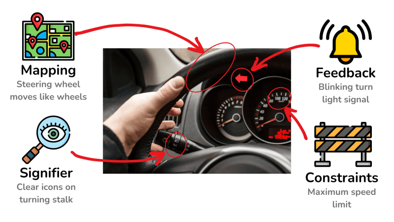
- This chapter introduces the principles of good design in everyday objects, including discoverability, affordances, signifiers, constraints, mapping, feedback, and conceptual models.
- Affordances are key functions of an object, which should be made visible or discoverable with signifiers, like a vertical bar on a door is a clue to push it there.
- Constraints guide and limit user actions, mapping is a clear spatial relationship between an object and its controls, users should receive immediate feedback on their actions, and people form conceptual models to understand how things work
Chapter 2 Summary
- This chapter explains how people interact with objects through the Gulfs of Execution and Evaluation. The Gulf of Execution involves figuring out how an object operates using signifiers, constraints, mappings, and conceptual models. The Gulf of Evaluation involves understanding what happened through clear feedback and a good conceptual model.
- The chapter also introduces the Seven Stages of Action, which include planning, specifying, performing, perceiving, interpreting, and comparing actions, all of which connect to the seven fundamental design principles.
Chapter 3 Summary
- This chapter examines the balance between knowledge stored in the user’s mind and knowledge available in the environment. Because our memory is limited, providing external cues and reminders can enhance the usability of your products.
- A best practice is to use natural mapping, where the control for something is right on the part being controlled, but if that’s not possible then use a spatial relationship—for example, arranging the controls for a stove’s burners in the same square pattern as the burners themselves.
Chapter 4 Summary
- Norman explains the four types of constraints—physical, cultural, semantic, and logical—that guide user actions and prevent errors. For example, a physical constraint is like a battery that only fits into a camera one specific way. Cultural constraints are based on social norms and conventions, so if you learn how to drive one car then you can drive most of them.
- Additionally, feedback is crucial for guiding users and preventing errors, whether through sound, visual signs, or other means.
Chapter 5 Summary
- This chapter talks about “human error,” arguing the root cause of almost all errors is not human mistakes, but design flaws. Root cause analysis is to keep asking why an error happened until you find the real cause.
- There are two types of errors: Slips (right plan, wrong action) and Mistakes (wrong plan), with slips often occurring due to distractions and mistakes due to incorrect information or lack of knowledge.
- Effective design should account for human mental limitations by using constraints, checklists, and sensibility checks, and by providing mechanisms like UNDO to minimize the impact of errors.
Chapter 6 Summary
- This chapter emphasizes the importance of solving the correct problem in design by identifying the real root issue rather than the first one you’re given. The Double-Diamond Model of Design is about first diverging to explore what users really need and converging to define the real problem, then diverging again to generate many ideas of potential solutions and finally converging on the best one.
- The Human-Centered Design (HCD) Process ensures products meet users’ needs and are understandable, usable, and enjoyable. It involves four key activities: Observation to uncover deep needs, Idea Generation to explore a wide range of solutions, Prototyping to create simple models, and Testing to refine through user feedback. This is an iterative process, so you cycle through these activities to continuously refine your product
Chapter 7 Summary
- This chapter highlights the competitive forces in business that affect design, focusing on price, features, and quality. New products must satisfy various stakeholders to succeed, including investors, distributors, and customers. While established products often face pressure to add features from customers and competitors, leading to “featuritis”—making the product confusing or identical to everything else.
- It also discusses two forms of innovation, incremental and radical. Designers love radical innovations, often driven by technology, but they usually fail. Incremental innovation, the continual refinement of an existing idea, is a far more reliable way to succeed.
- Finally, it touches on the moral obligations of design, emphasizing the potential of technology to fundamentally change us, for better and worse.
Why is feedback important in design?
Enhances aesthetics
Reduces costs
Saves time
Guides users
Now, let’s move on to a deep dive into the best practical ideas and key takeaways in this book…
👁️ 2. The Power of Discoverability: Visible design elements called signifiers reveal how to use a product intuitively

Everyday objects often cause confusion due to poor design, such as doors that push when they should pull. Good design communicates possible actions clearly through discoverability and signifiers. Discoverability ensures that users understand what actions are possible, while signifiers indicate how to perform those actions. Minimalist designs often fail in this regard, necessitating explicit instructions like “push” or “pull,” which indicate a failure in design.
In our daily interactions with objects, we often encounter moments of frustration that stem from poor design. Consider a door: you approach it, push, but it doesn’t budge. Then you pull, only to find that you should have pushed. This common situation highlights the importance of signifiers and discoverability in design.
Discoverability refers to an object’s ability to communicate what actions are possible, which the author calls affordances. A well-designed object should intuitively inform the user of its functionality. For example, just by looking at a chair we should be able to perceive it’s primary affordance—that we can sit on it and where to sit.
Signifiers are the visual or physical indicators that guide users on how to use an object.
For example, a vertical plate on a door signifies that it should be pushed, while a vertical handle indicates pulling. When designers neglect these intuitive cues called signifiers for the sake of aesthetics, users are left guessing, often leading to the need for explicit instructions like “push” or “pull.” A simple object like a door that must rely on written instructions is a clear example of poor design.
A bad example of signifiers in app design can be found in some poorly designed mobile banking apps. For instance, if the action to transfer funds is hidden deep in a submenu, users may never find it. An effective signifiers might look like a button with an icon of a dollar sign paired with an arrow indicating movement, that would make the action intuitive and prevent confusion.
The paradox of technology is that while it promises to make our lives easier, it can often lead to greater frustration if not well-designed. Consider the evolution of wristwatches. Older models had a single knob for winding and setting the time, a simple and effective design. Modern watches, however, come with many buttons and functions, which can be overwhelming and confusing due to their small size and complex functionality.
Human-Centered Design (HCD) addresses these issues by focusing on the needs and behaviors of users. It starts with observation, understanding how people truly interact with products. Then moves to communication, designing products that accommodate people’s behaviors and expectations. This process involves rapid iteration and testing to refine the design continually.
Ultimately, good design is an act of communication. It requires a deep understanding of the user and the context in which the product will be used. By focusing on discoverability and signifiers, designers can create products that are intuitive and easy to use, minimizing frustration and enhancing the overall user experience.
In the book “Hooked: How to Build Habit-Forming Products” by Nir Eyal, the concept of “triggers” plays a crucial role in creating products that users keep coming back to. Triggers are cues that prompt users to take action. They can be external, such as notifications, emails, or advertisements, or internal, such as emotions or thoughts that remind users of the product. The goal is to create a habit loop where triggers lead to actions, which in turn provide rewards, reinforcing the behavior and making it more likely to recur.
An example of using triggers effectively can be seen in social media platforms like Facebook. External triggers, such as push notifications about friends’ activities or messages, prompt users to open the app. Once inside, users are rewarded with the pleasure of social connection and updates. Over time, internal triggers, such as boredom or the desire for social validation, drive users to check the app without needing an external cue. This continuous loop of triggers and rewards helps embed the product into users’ daily routines, making it a habitual part of their lives.
In design, what is a signifier?
Written instructions
Physical indicator
User behavior
Design aesthetics
🔔 3. Clear Feedback: Create smooth and predictable user experiences with clear feedback

Feedback confirms a user’s actions and provides necessary information about the results, reducing confusion and frustration. While lack of feedback can be problematic, excessive or unclear feedback can be equally disruptive.
Imagine pressing an elevator button and nothing happens. You press it repeatedly, unsure if the elevator is responding. This lack of feedback creates confusion and frustration, leaving you uncertain about whether your action was registered.
Now, consider an elevator panel where the button lights up immediately when pressed. This clear, immediate feedback reassures you that the elevator is on its way, eliminating any guesswork.
Good feedback confirms your actions and informs you of the system’s status, making the interaction smooth and predictable.
A simple rule of thumb is to provide feedback in 0.1 seconds after a user action. For example, software app developers can provide a rotating icon or a progress bar to show activity is happening in the background when some process takes longer to complete. This prevents the user from pressing the button repeatedly or feeling confusion about whether their click was registered.
However, feedback can become problematic when it is excessive or unclear. For example, some devices use a series of beeps and flashing lights to indicate various statuses. If these signals are ambiguous or too numerous, they can overwhelm and confuse the user instead of providing clarity. The goal is to strike a balance: enough feedback to inform without causing distraction or misunderstanding.
Continuous feedback is particularly important in many contexts. In cars, for instance, various sounds and lights provide essential information about the vehicle’s status. A car door that hasn’t been shut completely or a muffler that is malfunctioning make distinct sounds that inform us something has not gone right. For electric cars, which are silent at low speeds, designers actually have had to introduce artificial sounds to ensure pedestrian safety, demonstrating how feedback is crucial for safety.
How quickly should feedback be provided after a user action?
0.1 seconds
1 second
2 seconds
5 seconds
🗺️ 4. Control Mapping: Making controls more usable through intuitive spatial relationships
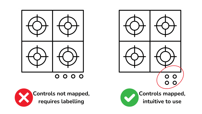
Natural mapping is about designing controls so that their relationship to the part of the object they control is clear and intuitive. This reduces the cognitive load on users and minimizes errors. Effective natural mapping uses spatial relationships, such as designing a stovetop where the controls are positioned to match the layout of the burners they control.
Natural mapping is a fundamental principle in design that makes the relationship between controls and their effects clear and intuitive. When designers use natural mapping effectively, users can understand how to operate a device or system at a glance, without needing extensive instructions or trial and error.
Imagine walking into a room to give a presentation. You are faced with a long row of identical light switches. You fumble around, trying multiple switches before finding the right ones to control the lights you need. This situation highlights the confusion that arises from poor mapping. Each switch in a row has no discernible relationship to the lights in the room, forcing you to rely on trial and error.
Now, consider a well-designed alternative: a control panel where the switches are arranged in the same layout as the lights they control. If the lights are laid out in a rectangular pattern on the ceiling, the switches are similarly arranged on the panel. This spatial relationship allows you to intuitively understand which switch controls which light, reducing the need for guesswork. Don Norman actually installed a light switch panel just like this in his home.
The principle of natural mapping extends beyond light switches. For example, consider the controls on a stovetop. Ideally, the knobs should be arranged in a way that mirrors the layout of the burners. If the burners are in a rectangular formation, the knobs should be too. This way, you immediately know which knob controls which burner, without having to look at labels or instructions.
Good mapping also follows the principle of grouping related functions together and maintaining proximity between controls and the objects they manipulate. For instance, in a car, the window controls are placed on the door next to the window. This proximity makes it clear and convenient to understand their function.
What does natural mapping help achieve in design?
Nicer aesthetics
Higher costs
Easier production
Clear control relationships
In the book “Made to Stick” by Chip and Dan Heath, the “Curse of Knowledge” describes the challenge that arises when experts forget what it’s like not to know something. This cognitive bias can hinder effective communication, especially in product design, where designers may assume that users have the same understanding of the product as they do.
An example of the Curse of Knowledge in product design can be seen in the development of user interfaces. A designer who is deeply familiar with the technical aspects of an app might create a navigation system that makes perfect sense to them but is confusing and unintuitive for new users. To overcome this, designers must empathize with users, conduct usability testing with real users, and gather feedback. This helps ensure that the product is accessible and understandable to all, regardless of their prior knowledge or expertise.
🚧 5. Guiding Constraints: Design limitations that naturally lead users to the correct actions
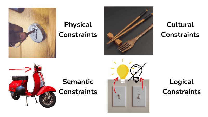
Constraints are essential in design as they limit and guide user actions, making it easier to determine the proper course of action. There are four types of constraints: physical, cultural, semantic, and logical, each providing different ways to influence user behavior and ensure products feel intuitive.
Constraints are a crucial aspect of design that helps guide users towards the correct actions while limiting the possibility of errors. By incorporating thoughtful constraints, designers can create products that are intuitive and easy to use, even when someone has never used it before.
There are four main types of constraints:
- Physical Constraints: These rely on the physical properties of objects, like a square peg won’t fit into a round hole. A practical example is the design of camera batteries, which can only be inserted in one way, unlike the common AA battery designs that can fit backwards.
- Cultural Constraints: These are based on learned conventions and social norms. How machines are used can be standardized by cultural conventions or laws, and that helps us to use a new machine quickly. For example, you can probably sit in most cars and drive them right away.
- Semantic Constraints: These involve the meaning we derive from context. Semantic constraints leverage our understanding of the world to inform us how to interact with objects. For example, there is only one meaningful way to sit on a motorcycle, guided by its shape and structure.
- Logical Constraints: These use logical relationships and reasoning to guide user actions effectively. An example is the natural mapping where the left switch controls the left light in a room, and the right switch controls the right light.
In addition to these constraints, designers can use mechanisms like interlocks, lock-ins, and lockouts to enforce desired behaviors. For example, a car key must be inserted before the vehicle can start (interlock), a computer program may prompt you to save before closing (lock-in), and child locks on cabinets prevent access to dangerous items (lockout).
Sometimes, if all else fails, standardization becomes necessary. For example, standardized designs for faucets ensure they all work in the same way, reducing confusion. However, sticking to old standards can sometimes hinder progress, as seen with the slow global adoption of the metric system.
What is an example of a physical constraint?
Childproof medicine cap
Color coding
Instruction Manual
Software update
🧠 6. Conceptual Models: Create simplified mental models to give users a sense of control

Conceptual models are simplified explanations of how things work, helping users form mental models to understand and interact with products. Effective conceptual models provide a sense of control and aid in troubleshooting when things go wrong.
Conceptual models play a crucial role in how we interact with and understand everyday objects and systems. These models provide simplified explanations that help us form mental images of how things work. For example, when using a computer, the analogy of files and folders allows us to easily grasp how data is organized and accessed, even if we don’t understand the underlying technology.
A good conceptual model gives users a feeling of control, enabling them to predict outcomes and troubleshoot problems.
On the other hand, poor conceptual models can lead to confusion and frustration. Consider the case of a thermostat: many people believe that turning it all the way up will heat a room faster, a misconception based on a flawed conceptual model. The reality is that thermostats work to maintain a set temperature, not to control the speed of heating.
People are natural storytellers, constantly seeking to explain and make sense of their experiences. They piece together information from their interactions with a product, forming explanations and stories that guide their use. Even if these stories are based on incorrect assumptions, they persist as long as they seem to match the observed outcomes.
The concept of the System Image is critical here. The designer’s conceptual model shapes the system image, which in turn influences the user’s conceptual model. However, there is often a disconnect between the designer’s intentions and the user’s understanding. This gap can result in users forming incorrect theories about how a product works based on incomplete or misleading information.
Effective design should aim to create clear and accurate conceptual models that align the system image with the user’s mental model. By doing so, designers can help users feel more in control, reduce errors, and enhance overall satisfaction with the product.
What does a good conceptual model provide to users?
Increased speed
More features
Lower cost
Feeling of control
❌ 7. Designing for Errors: Minimize the impact of mistakes by accounting for human limitations

Errors often blamed on human mistakes are frequently due to poor design. Designers need to create systems that account for human limitations and predict common errors, reducing their impact with techniques like an undo button, constraints, checklists, and sensibility checks.
In many instances, what is labelled “human error” is actually a result of poor design. When systems fail to consider human limitations and behaviors, users are more likely to make mistakes. This often leads to frustration and self-blame, when the true fault lies in the design of the system.
Consider a scenario where software requires users to press “enter” to save their work, but pressing “return” erases everything. This is an actual case study from a company the author consulted for. Many company employees tested the software and accidentally erased their work, but didn’t report the error because they blamed themselves for “not using it right” so the designer was unaware of the huge flaw. A better design would recognize the potential for such mistakes and incorporate safeguards, like using a different key for erasing data or providing a confirmation prompt beforehand.
Root cause analysis is a powerful tool in addressing these issues. By continually asking “why” until the fundamental cause of a problem is identified, designers can understand and address the underlying issues that lead to errors. This method, pioneered by Toyota, has been instrumental in improving product quality and reliability. When a defect is spotted in a Toyota factory, any employee can pull a special andon cord, which stops production until the cause of the defect is identified, thus preventing future occurrences.
Errors are often exacerbated by social and institutional pressures, such as tight deadlines or unrealistic expectations. In many situations, an employee cannot get their job done unless they cut corners, not following every safety procedure. In high-stakes environments, like aviation, this can have catastrophic consequences. For instance, in the 1977 Tenerife airport disaster, time pressure and poor communication led to a fatal misjudgment, causing the deadliest aircraft collision of all time. Good systems design allows for clear, stress-free decision-making.
To reduce errors, systems should incorporate multiple strategies:
- Constraints can prevent mistakes by making incorrect actions difficult or impossible. For example, ATMs require you to take your card before dispensing cash to prevent leaving the card behind.
- Checklists are another effective tool, used in aviation and healthcare to ensure that all critical steps are followed.
- Minimizing interruptions can also reduce errors. The “sterile cockpit” rule in aviation prohibits non-essential conversation during critical phases of flight to maintain focus.
- UNDO options in software allows users to easily correct mistakes, reducing the consequences of slips.
- Sensibility checks in technology can prevent illogical actions. For instance, financial apps often ask for confirmation before sending an unusually large sum of money, ensuring that the user intended the action.
By designing with these principles in mind, we can create systems that not only accommodate human limitations but also enhance overall safety and usability. This approach shifts the responsibility from the user to the design, fostering environments where errors are less likely and more easily corrected.
Which strategy prevents users from making illogical actions in a software app?
Constraints
Sensibility checks
Undo options
Checklists
🔄 8. Iterative User Testing: Continuously refine your product with multiple rounds of testing and feedback
The most crucial aspect of design is solving the correct problem by identifying the root cause through continuous questioning. The Human-Centered Design Process involves: observation, idea generation, prototyping, and testing. Followed by refinement with multiple iterations to ensure the product meets user needs and provides a positive experience.
In design, one of the fundamental principles is to ensure that you are solving the right problem. This often involves delving deep into the issues and repeatedly asking “why” until the true root cause is identified. For instance, if users are requesting a more powerful drill, the real need might be to hang shelves more effectively, which could lead to exploring entirely new solutions beyond just a better drill.
The Human-Centered Design (HCD) process is essential for developing products that are not only functional but also intuitive and enjoyable to use.
- This process starts with observation, where designers engage with potential users to understand their behaviors, needs, and pain points. Unlike market research, which often focuses on broad quantitative data, design research is more qualitative, involving direct interaction with a smaller group of users to uncover deeper insights.
- Next comes idea generation, a creative phase where all ideas are welcome, and nothing is dismissed too quickly. Encouraging wild ideas can lead to innovative solutions, as these often challenge the status quo and uncover new possibilities. For example, questioning why a task has always been done a certain way can reveal hidden assumptions and lead to breakthroughs.
- Prototyping involves creating simple models of the product, which can range from sketches to cardboard models or digital mock-ups. The “Wizard of Oz” technique, where a prototype is manually operated behind the scenes to simulate functionality, can be particularly useful for testing concepts without full development.
- Testing these prototypes with a small group of users—typically around five at a time—provides invaluable feedback. Observing users interact with the prototype reveals usability issues and insights that might not have been anticipated.
Iteration is the final and ongoing phase, emphasizing the HCD process is a cycle that you repeat. Each round of testing informs further refinements, making the product better and better. This iterative approach, common in software development methodologies like Scrum and Agile, contrasts with the older, linear waterfall method, which can be inflexible and less suited to innovative product development.
For example, consider developing a new app for managing personal finances. The process would start with observing how people currently handle their finances, understanding their frustrations and needs. Idea generation might produce a range of concepts, from simple budgeting tools to comprehensive financial planners. Prototyping a few of these ideas and testing them with users will highlight which features are most useful and which interfaces are most intuitive. Based on this feedback, the design is iterated and refined, ensuring the final product truly meets user needs and offers a seamless experience.
By continuously testing and refining, designers can ensure that the final product is not only effective in solving the right problem but also provides a positive and engaging user experience.
In the phase of design called idea generation, what is encouraged?
Immediate refinement
Strict rules
Wild ideas
Conservative thinking
One of the key ideas from “The Lean Startup” by Eric Ries is the concept of the Minimum Viable Product (MVP). An MVP is the simplest version of a product that allows a team to collect the maximum amount of validated learning about customers with the least effort. In product design, applying the MVP approach means focusing on the core features necessary to address the main problem your product aims to solve.
For example, if you’re designing a new fitness app, your MVP might include just the essential tracking and logging functions without additional features like social sharing or advanced analytics. By releasing this MVP to a small group of users, you can gather feedback, learn what works and what doesn’t, and make informed decisions about which features to build next. This iterative process helps ensure that the final product is more aligned with user needs and reduces the risk of investing in features that may not be valued by users.
⚖️ 9. Balancing Innovation & Competition: Navigate the pressures of competition, technology, and customer needs for successful design
Effective product design requires balancing competing priorities such as affordability, beauty, utility, and differentiation from competition—all coming from various departments of the company. While innovation can be both incremental and radical, it often faces constraints like budget and schedule.
Designing a successful product is a complex challenge that involves balancing various competing priorities and departments including design, marketing, engineering, accounting, etc. For example, some team members may prioritize affordability, ensuring that the product is accessible to a wide range of consumers. Others might focus on aesthetics, aiming to create a beautiful and appealing product. Utility is another crucial factor, as the product must serve its intended function effectively. Lastly, differentiation ensures the product stands out in a crowded market.
In reality, product development is often heavily influenced by what competitors are doing and the emergence of new technologies. This competitive landscape can lead to a phenomenon known as “featuritis,” where products become overloaded with features in an attempt to outdo competitors and satisfy all customer requests. However, this can detract from the product’s core functionality and user experience.
The moral obligations of design also come into play. Redesigning products solely to drive sales—by making them less durable, creating seasonal fashions, or adding unnecessary features—raises important ethical questions.
Competitive forces play a significant role in shaping product design. Factors like price, features, and quality are paramount. New products must satisfy multiple stakeholders, including investors, distributors, and end-users.
There are two forms of innovation: incremental and radical. Incremental innovation involves continuous testing and refinement of existing products, providing a reliable path to success. Radical innovation, on the other hand, is often driven by new technologies and can lead to groundbreaking products, but it carries a much higher risk of failure.
For instance, the development of multitouch displays began in the 1980s, but it took over 20 years for the technology to gain traction and become mainstream. This long timeline highlights the challenges of bringing new technologies to market and the importance of patience and persistence in the innovation process.
As we look to the future, technology will continue to change how we live and work. The author has a thought-provoking idea that we humans are not smart by our sheer brainpower, but it is “things that make us smart” emphasizes the synergy between humans and machines. Rather than viewing technology as a competitor, we should see it as a collaborator that enhances our capabilities. For example, the best chess players in the world work WITH a computer, by doing so they can beat all other players or all other computers working separately.
The rise of individual creators using new tools to bring their ideas to life is another exciting development. Self-publishing, 3D printing, and other technologies empower individuals to innovate and share their creations with the world, democratizing the design process.
In product development, what is "featuritis"?
Reducing product features
Simplifying core experience
Enhancing user experience
Overloading with features
- Add clear signifiers: For every important affordance or capability your product allows, make sure there is some visible clue that reveals that utility. For example, a handle on top if it’s meant to be picked up often.
- Ensure immediate feedback: Add audible alerts or visual indicators that provide instant confirmation of important actions.
- Include constraints: Use templates or checklists for an important process to guide correct actions and reduce errors.
- Create mental models: Practice explaining tasks using a physical analogy or simplified diagrams.
- Reduce errors: Add safeguards to minimize the impact of mistakes like confirmation prompts, auto-save, or undo buttons in software apps.
- Test regularly with users: Gather real-world feedback from users to improve your product or project.
- Stay updated on trends: Follow industry trends and competitor product to inform your future innovations.


Community Notes